DESIGN PRINCIPLES
|| Leong Hui Xuan 0365793
|| 03/02/2025- 22/02/2025 (Week 1 - Week 3)
|| Bachelor of Design in Creative Media
|| Task 1 : Exploration
Table of Content
MODULE INFORMATION BOOKLET
Visual communication uses design elements and principles to convey
a purposeful message to a target audience.
Elements of Design : (Figure1.1)

|
|
Figure1.1, Design Elements Diagram. (Source: HERE)
|
[Point]
- Simplest element used as repetitive mark to form a line, others
figures and forms created when the point moves in space.
[Line]
- Can be active or static / aggressive or passive / sensual or
mechanical.
- It indicate directions / boundaries (shapes and spaces) / volumes
or solid masses / motion or emotion.
- Grouped to depict qualities of light and shadow / form patterns and
textures.
[Shape]
- Expanse within the outline of 2D area or 3D ocject.
- Enclose an area / change in value (lightness/ darkness) / colour /
textures from surrondingd.
- Geometric and Organic.
- Geometric shape tend to be precise and regular.
[Form]
- 3D area, when 2D area referred as a shape,
- Form encloses space, it called volume.
- Major element in sculpture and architexture
- Implied in 2D media
[Texture]
- Tactile qualities of surface.
- Can experienced by touching / visual suggestion.
- Actual (touch) and simulated / implied (look like real
texture).
[Space]
- Indefinable, general of all things.
- We see the surface all at once in drawings / printing / photographs
/ painting,
- Actual space defined by its edges (2D height and width).
- Infinite number implied within these limited boundaries.
- 3D experienced when we are in it, outside (mass), inside
(volume).
- Defined as positive (filled space) / negative (empty space)
in graphic design, space, or depth.
- Illusion of 3D space through depth.
[Colour]
- Visual byproduct of light spectrum.
- Light wavelengths that human eye receive and processes.
- Hue: Colour of spectrum (yellow and green).
- Value: Lightness or darkness (white-grey-black).
- White and black important in changing values. White + hue = tint,
grey + hue = tone, black + hue = shade.
- Intensity: Purity of a hue.
- Pure hue is most intense.
- A harmonies colour groupings are called colour schemes.
- Monochromatic based on variations in the value and intensity of
single hue.
- Analogous based on adjacent to another containing the same pure hue
on the colour wheel.
- Complementary emphasis two hues directly opposites.
Principles of Design:
⚬ Contrast:
- Juxtaposition of strongly dissmilar elements.
- provide visual interest / emphasis a point and express
content.
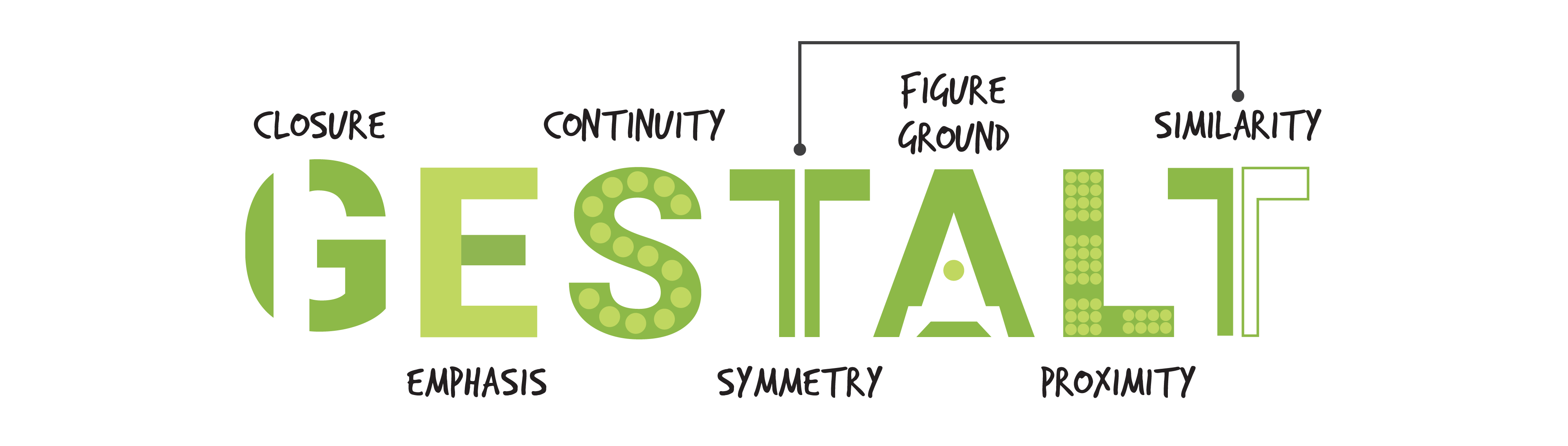
⚬ Gestalt Theory (Figure1.2):

|
Figure1.2, Gestalt Theory (Source:
HERE)
|
- Shape / form in German.
- Rules that show how human eye perceive visual elements and perceive
shapes as a single united form.
- Complex scenes can be reduced to simple shapes.
[Principle of Similarity]
- Perceive complete picture / shape / group.
- Craft a link of a similar nature.
[Principle of Continuation]
- Follow the design to
see a continuous flow.
[Principle of Closure]
- Prefer to observe complete shapes.
- If not, perceive a complete shape by filling in missing visual
information.
[Principle of Proximity]
- Process of ensureing related design elements are placed
together.
- Close proximity shows that items are connected to each other and
become one visual unit.
[Principle of Figure / Ground]
- Object are either in the background or foreground.
[Law of Symmetry and Order]
- Elements are symmetrical to each other as a unified group.
-
More likely to grouped together.
⚬ Emphasis:
- Visual reinforcing something, used to train the
viewer's eye on the area that the viewer's eye first saw.
- Create the contrast through colour, placement, variation,
alignment, isolation, convergence, anomaly, proximity, size and
contrast.
⚬ Balance:
- Elements arranged to a sense of visual equilibrium /
stability.
- Can be symmetrical, asymmetrical or radial.
⚬ Repetition :
- Tying individual elements and bring a sense of consistency.
- It create rhythm and patterns.
- Variation increase the level of interest.
⚬ Movement:
- Visual flow.
- Static elements to direct viewer's eye along a path through the
work.
- Such as, line, diagonals, unbalanced elements, placement, and
orientation.
- Move / move on their own.
⚬ Harmony:
- Composition with similar and related elements (colours /
shapes).
- Logical relationship, connection, alignment,or progression.
⚬ Unity:
- Using harmonious, similarity and repetition / continuance /
proximity / alignment.
- Linking various elements.
- Allows to create a unified whole.
⚬ Symbol:
- A sign / shape / object present something else.
- Symbol provide information equivalent to one or more sentences /
text / story
[Figurative Representations] - Visual / Graphic symbols / Pictorial
symbols / Abstracr symbols / Arbitary symbol.
[Non- Figurative Representations]
⚬ Word and Image:
- Imagery is virtal part of design.
- Use suitable and relevant images to deisgn.
- Typerface and position affect the result in visual hierarchy and
balance in a work.
- Convey messages.
PROCESS WORK
Gestalt Therory:
This book cover (Figure 1.3)
effectively applies gestalt theory to create a visual compelling.
It uses figure-ground principle (Figure 1.3.1) in Peter's profile emerges from the negative space of the wolf's
silhouette, let the viewer to switch between the two figures. Besides,
the law of closure (Figure 1.3.1) allows the viewer complete Peter's look, enhancing simplicity and
engagement. These Gestalt principles work together to create a
composition where the storytelling is dominant, reinforcing the book’s
theme and visual appeal.

|
Figure 1.3, Book cover of Peter and the Wolf
by Sergei Prokofiev (1936) illustrated by Phoebe
Morris. (Source: Here)

|
|
Figure 1.3.1, The explanation version of the book
cover
|
|
Contrast:
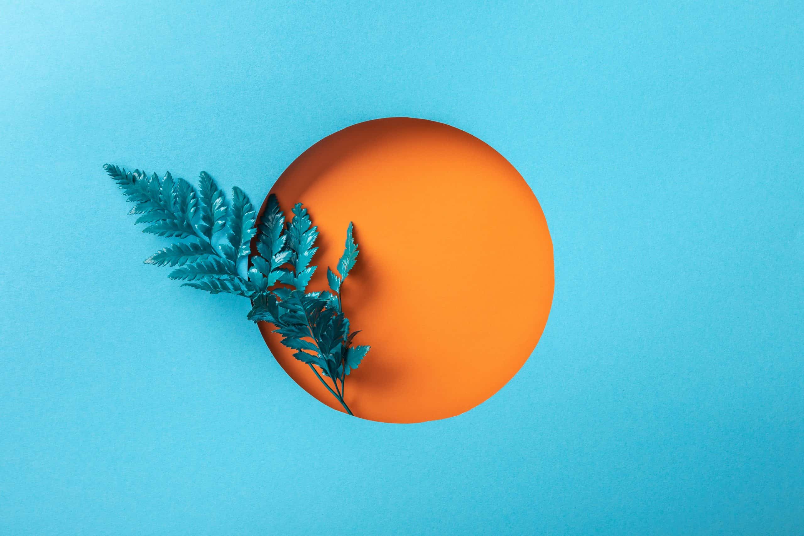
This picture (Figure 1.4) have a high contrast in color which use complementary color
to form it ( blue and yellow / red and green). The orange circle
in focal point shows a hight contrast with the light blue
background and it catch the viewer's eye at the first look.
Besides, the proportion
of the color also affect the visual effects, the greater the difference in the proportions of the two colors
used, the more it will contrast.

|
|
Figure 1.4, The example photo of Contrast. (Source: HERE)
|
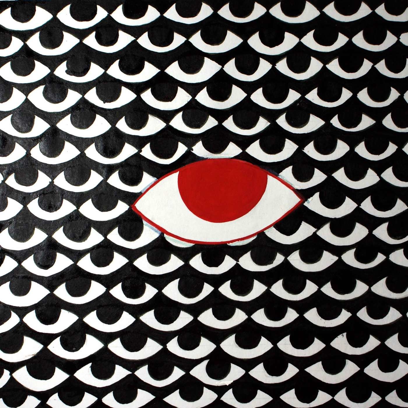
Emphasis:
In this artwork (Figure 1.5), colour and size make a contrast to show the principle of emphasis. The common
eyes in the work are all black and the same size, but the red eye in
the middle breaks this phenomenon with its bright red color and
larger size than the other eyes.

|
|
Figure 1.5, Visual design works by Gautam
Kumar.(Source: HERE)
|
Balance:
This Gothic Rose window at Strasbourg Cathedral (Figure 1.6) shows a radial balance where elements radiate symmetrically from a central point. The windows are divided into sections by stone mullions and
tracery to create a balanced composition. This symmetrical layout distributes visual weight evenly around the
center, creating a sense of stability.

|
|
Figure 1.6, Interior of the rose at Strasbourg Cathedral.
(Source: HERE)
|
Repetition:
This painting (Figure 1.7) shows principle of repetition particularly in the swirling
branches, geometric patterns, and ornamental motifs. It is
characterized by repeated spirals that run throughout the composition, creating a rhythmic flow that
unifies the elements and guides the viewer's eye. By using
repetition principle, this painting establishes visual balance and a
hypnotic, dreamlike quality.

|
|
Figure 1.7, Artwork The Tree of Life by Gustav Klimt (1910). (Source: HERE)
|
Movement:
The Starry Night by Vincent van Gogh (Figure 1.8) is one of the famous painting which represent the principle of
movement through the painting’s swirling brushstrokes, dynamic lines, and rhythmic patterns
create a strong sense of movement, guiding the viewer’s eye across the
canvas.There is a sense of energy and turbulence in the circular, flowing strokes
in the night sky. Besides, the diagonal lines of the cypress tree and rolling hills
contribute to this movement by leading the viewer’s gaze upward and
across the sky.

|
|
Figure 1.8, Vincent van Gogh’s The Starry Night (1889). (Source: HERE)
|
Harmony:
Principle of harmony refers to the pleasing arrangement of
elements to create a sense of unity and balance like this artwork (Figure 1.9) it shows harmony through the soft brushstrokes, blended colors, and tranquil composition. This painting uses a cohesive color palette
dominated by cool blues, purples, and greens, with hints of pink and
yellow to create a serene and unified visual experience.

|
Figure 1.9, Water Lilies by Claude Monet (1906). (Source: HERE)
|
Unity:
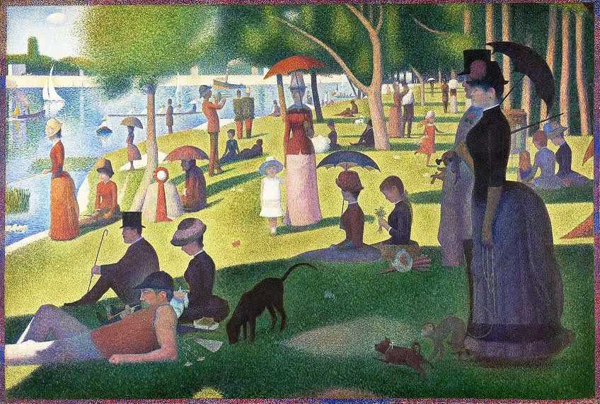
Principle of unity can refers to the arrangement of elements
in a composition to create a sense of cohesion and completeness. In the painting (Figure 1.10), the scene is rigorously structured, with figures, trees and
umbrellas recurring to create a sense of order. The arrangement of
figures and objects on the canvas ensures that no single element
dominates, and the warm tones of the painting create a unified atmosphere, thus enhancing the visual unity.

|
|
Figure 1.10, A Sunday Afternoon on the Island of La Grande
Jatte (between 1884 and 1886) by Georges Seurat (Source: HERE)
|
Symbol:
The symbol of Dove (Figure 1.11) often mean peace and purity and the promise of redemption and hope.
In Christian art, it represents the descent of the Holy Spirit at
important moments in the Bible. Artists use it to evoke a sense of
calm and sacredness.

|
|
Figure 1.11, The Dove symbol by Tatyana
Checkman. (Source: HERE)
|
Word and Image:
The poster (Figure 1.12) reads "Jaws" in bold red capital letters, emphasizing
the danger. Below it, a giant shark is seen swimming towards the unsuspecting
swimmers, visually complementing the text and heightening the sense of suspense and fear.

|
|
Figure 1.12, The poster of Film JAWS by Roger
Kastel. (Source: HERE)
|
Chosen Artwork:

|
|
Figure 1.13, Launching the Currach by James O'Halloran. (Source: HERE)
|
Title: Launching the Currach
Artist: James O'Halloran
Year: 2003
Size: 51 by 61cm., 20 by 24in.
Medium: Oil on Panel
This artwork (Figure 1.13) contains various design principles that we can find, the main principle
of this artwork is Harmony. The artist uses colour harmony to create a soothing and cohesive colour palette, the blues and
greens emphasising the aquatic environment. Besides, the dark boat and
figures create a principle of Contrast with the lighter and more vibrant water, allowing the viewer to focus on
it.
Additionally, this artwork also applies Gestalt Theory, such as figure/ground
and similarity. The main boat and figures are the dominant subjects, while the water
and distant elements (the small boat in the background) form the ground.
The figures and the boat have similar colour tones, showing their
connection as a group.
The combination of the principles creates a feel of peaceful and
quiet storytelling. I love how the artist allows the viewer's eye to
complete the scene, making it feel more dynamic and spontaneous, rather
than meticulously rendering each element.
FEEDBACK
Week 1:
General Feedback: Watch lecturer videos and start working on
e-blog.
Specific Feedback: Fill the consultation form and details, come
consultation during the mention timing.
Week 2:
General Feedback: Continue on task 1 and use the feedback from other
also for the in-text citation.
Specific Feedback: Watch all the lecture videos and done my task
1.
Week 3:
General Feedback: Place the image under the explanation text
and put an arrow symbol link to the upper part, so it will be more
convinient.
Specific Feedback: Change the bold front color to a more contrast to
easily get the main point, draw and mention out where is the principle
shows in the photo and change the front more bigger.
REFLECTION
Experience:
In this task, observation and research are the main things we need
to do. Based on what we have learnt in the lecturer's video and in
the past, we need to understand which part of the work the design
principles are applied to, what effects they bring, and how to
combine them to create different visual effects. I feel that I
have consolidated my knowledge and understanding of design elements
and principles through this task.
Observation:
After browsing a large number of artworks on the Internet, I feel
that I have made new discoveries about the combination of principles
and the rational application of different principles in an
artwork. Finding and understanding the artworks allows me to
quickly understand the use of design principles and the visual
effects they bring, although I am not yet proficient in using
them. By constantly browsing a large number of works and
accurately finding the parts that use design principles in the
works, I can improve my aesthetic level, which will make my future
works more in line with aesthetics and design principles.
Findings:
Design principles and elements can make the artwork look more
logical, whether it is the Gestalt theory in the design principle,
highlighting the foreground, middle ground and background to make
them look more real, or the principle of harmony, combining the
principle of similar colours to make the picture look harmonious,
enriching the colours, and making the picture look not monotonous. I
believe that through the design principles and elements, unexpected
creative effects and meaningful artworks can be created.
Click to above
Quick Link


Comments
Post a Comment